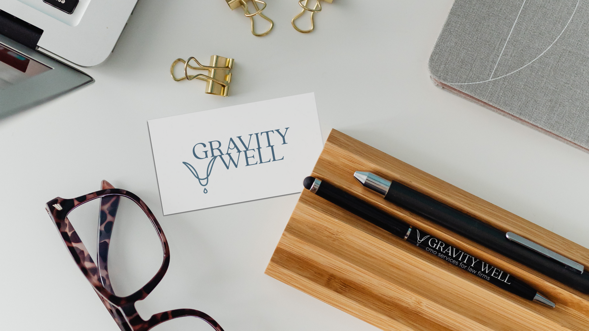
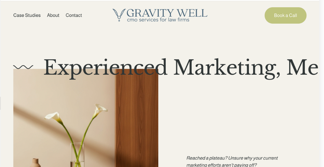
Gravity Well MarketingCreating a brand with just enough gravity to stand out, and just enough restraint to win over the traditionally conservative legal industry.
The design of the logo itself takes inspiration from the physics of a gravity well, playing with the ideas of convergence and precipice. Drawing everything toward a central point, the drop, became a visual metaphor for distilling complexity, honing in on what matters, and creating the conditions for growth.
The resulting identity uses this idea of focused energy to reflect Gravity Well's work helping established businesses push past growth plateaus, and chart a path toward their next stages.